Multiple-models plot
An example of Multiple-models plot is a multiple curve plot, where each curve describes the quality results for exactly one analyzed model. Every predicted model is represented by a di fferent color. The RMSD value (Y-axis) is computed for sphere of each amino-acid, which is denoted as atoms set localized inside it, through the polipeptide chain (X-axis) and a fixed sphere radius, where the center of the sphere is inside the considered amino-acid.
The Multiple-models plot describes in the understandable way the answer of question how accurate is the structural proximity of the particular amino-acid taking into consideration the accuracy level represented by selected sphere radius. Most often, with a low radius (which represents local structural proximity) the structural quality of local motives is very good for almost all amino-acids through the polipeptide chain. With the increasing value of radius we can simply observe the structural motives in the analyzed models which describes either acceptable prediction quality (represented by low values of RMSD) or important structural errors (represented by high values of RMSD) that should be widely and carefully analyzed and re fined.
It should be noted that the Y-axis, which represents the RMSD, is scaled to the signi ficantly worst model. It causes that models with very good prediction quality will not be presented in detail because the RMSD value for the worse model may dominate the visualization of errors for the model with a better accuracy. Hence, the user can analyze each model individually.
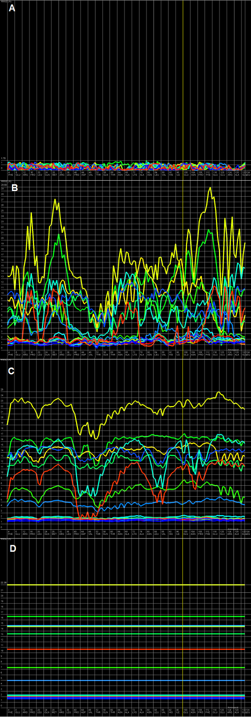
Figure 1. Multiple-models plot for T0522 target from CASP9 contest; each plot (A-D) represents results for a different sphere radius (3, 10, 24, and 300 Å). X-axis represents the order of amino-acids in the sequence, Y-axis represents the value of RMSD.
RMSD averaged plot
An example of RMSD averaged plot is shown in Figure 2. This is also a multiple curve plot, where each curve describes the average quality measure results for exactly one analyzed model (different colors correspond to different models). The difference between Multiple-models plot and RMSD averaged plot is that in the latter case the Y-axis represents average quality indicator values (e.g. RMSD) computed as average total of quality indicator coefficients of spheres built with fi xed radius for all amino-acids of analyzed protein molecule. This plot visualizes how average quality indicator coefficient changes with increasing sphere radius. In general, this plot describes the changes of quality of prediction from local to global point of view.
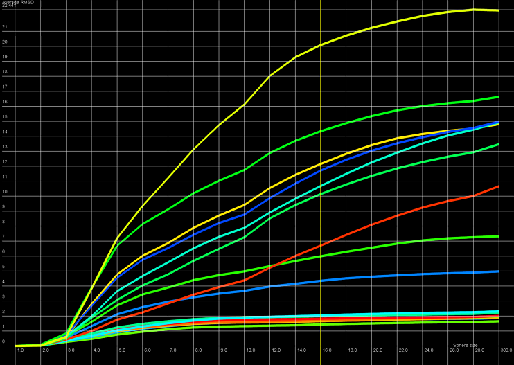
Figure 2. RMSD averaged plot; X-axis represents the sphere radius, Y-axis represents averaged RMSD for all spheres with fixed radius (different colors correspond to different models).
2D map plot
An example of a 2D map plot is presented in Figure 3. This plot visualizes exactly one model at a time. The quality indicator values (e.g. RMSD) are visualized as a color in a spectrum between blue (represents high accuracy of prediction) and red (represents low accuracy of prediction). The X-axis represents the amino-acids numbers in the sequential order and the Y-axis represents the radius values from spheres radiuses vector de fined by user. This plot shows simultaneously entire spectrum of accuracy for each amino-acid, allows the user to identify simply inappropriate structural motives in the analyzed model and give an intuition how signifi cant are those inconsistences. Moreover, it allows the user to check if prediction errors are similar for different predicted models.
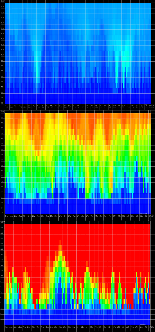
Figure 3. 2D map plot - each map corresponds to single analyzed model; X-axis represents the sequential orderering of amino-acids, Y-axis represents the sphere radius, color of the cell represents the structural quality from the spectrum between blue (represents high prediction quality) and red (represents low prediction quality).
3D plot
An example of a 3D plot is presented in Figure 4. The X-axis represents amino-acids numbers in sequential order, the Z-axis represents the radius values from the spheres radii vector defined by the user, and the Y-axis represents the RMSD measure results. The RMSD value is also represented with the colored scale. Both plots (2D map plot and 3D plot) describe the structural accuracy of fragments from the prediction model localized around certain amino-acids taking into consideration the entire accuracy levels spectrum.
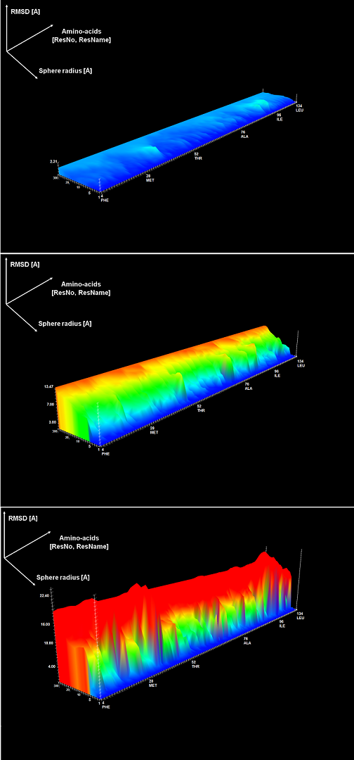
Figure 4. 3D plot – analysis of three models; X-axis represents sequential ordering of amino-acids, Y-axis represents increasing accuracy levels, Z-axis represents the RMSD measure results.
Cutoff plot
An example of a Cutoff plot is presented in Figure 5. Cutoff plot answers the question how good is the prediction of a particular model from a local point of view or, in other words, what part of the model structure is predicted correctly. The computation is performed based on the fixed (set by the user) precision threshold for each sphere radius, de noted in sphere radius vector. As a result, the user recives information about the percentage of atom set predicted below a fixed precision threshold (denoted as cutoff ). The cuto ff threshold can be iteractively changed by user. The tool allows also to exclude from analysis incomplete or not predicted regions of the reference structure.
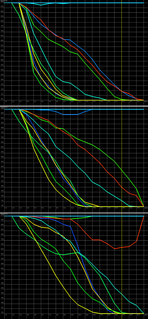
Figure 5. Cutoff plot presents the percentage of amino-acids included in spheres with fixed radius for each considered model, which are below a selected precision threshold. Every curve corresponds to single model. X-axis represents sphere radius, Y-axis corresponds to "correctness" percentage. On the picture above we can observe plots for different precision thresholds (top to bottom ordering: 4 Å, 7 Å and 11 Å) for radius of the sphere equal to 24 Å (each predicted model is represented by a different color).